Astro
MDX components
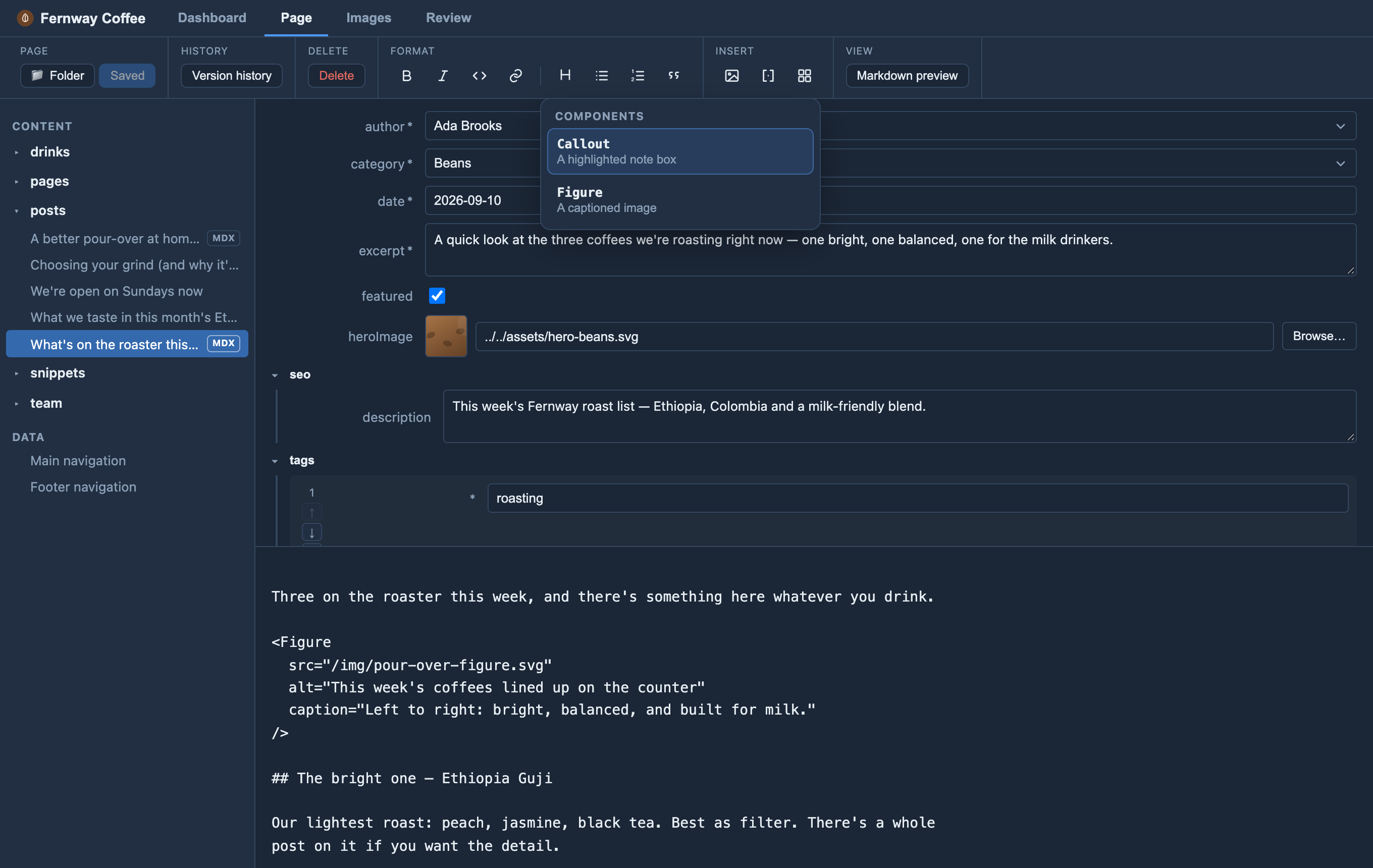
For .mdx collections, editors can insert components you declare under
components: in orbit.config.yaml — a name, optional
description, whether it wraps children, and scalar props
(string / number / boolean / enum).
Orbit builds the JSX tag from a small form and inserts it. In preview it shows a placeholder card — Orbit never runs your components; your Astro site renders the real component at build.
Components only work in .mdx files (Astro ignores JSX in plain .md), so Orbit
marks .mdx entries with a small MDX tag in the sidebar and only shows the
Insert a component toolbar button when an .mdx file is open.
Set up MDX in your Astro site (developers)
Components only work in .mdx pages, so this is a one-time setup on the site.
1. Add the MDX integration. From the site root:
npx astro add mdxThat installs @astrojs/mdx and registers it in astro.config.mjs. To do it by
hand: npm install @astrojs/mdx and add it to integrations:
// astro.config.mjs
import { defineConfig } from "astro/config";
import mdx from "@astrojs/mdx";

export default defineConfig({
  integrations: [mdx()],
});
See Astro’s MDX integration guide.
2. Let the collection hold .mdx files. In src/content.config.ts, use a
glob loader whose pattern includes .mdx (Astro 5+):
import { defineCollection } from "astro:content";
import { glob } from "astro/loaders";

const blog = defineCollection({
  loader: glob({ pattern: "**/*.{md,mdx}", base: "./src/content/blog" }),
  // schema: ...
});
That glob is also what lets editors create .mdx pages: Orbit shows an
MDX tick box on new pages only where the pattern accepts
.mdx and @astrojs/mdx is installed (step 1). Leave .mdx out of the glob
and editors can only make plain Markdown pages there.
3. Build the component as you normally would (e.g. src/components/Callout.astro)
and import it where the page renders.
4. Declare it for editors under components: in orbit.config.yaml:
components:
  - name: Callout
    description: A highlighted note box
    children: true          # <Callout>…</Callout> vs self-closing <Figure/>
    props:
      - { name: type, type: enum, options: [note, tip, warning], default: note }
      - { name: title, type: string }
Declaring the catalog keeps editors to the set you support instead of typing arbitrary JSX. Only scalar props are offered in the form; the JSX Orbit inserts is plain text your build compiles.